Saturday, April 29, 2006

Senate Voting Patterns, part 3


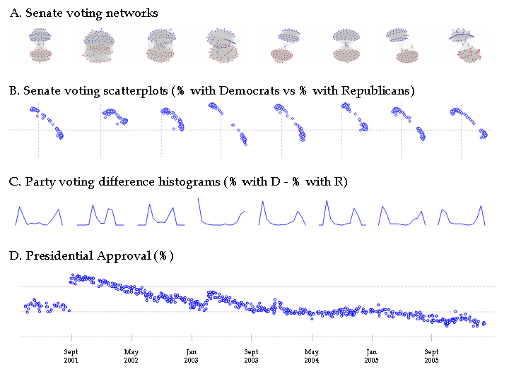
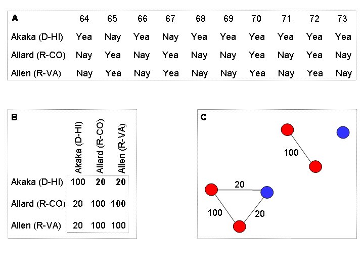
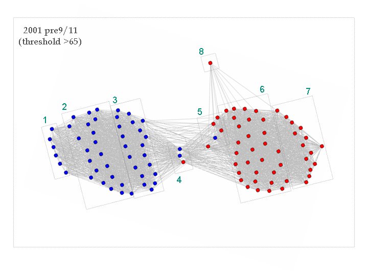
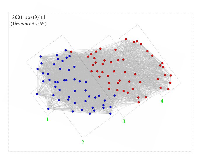
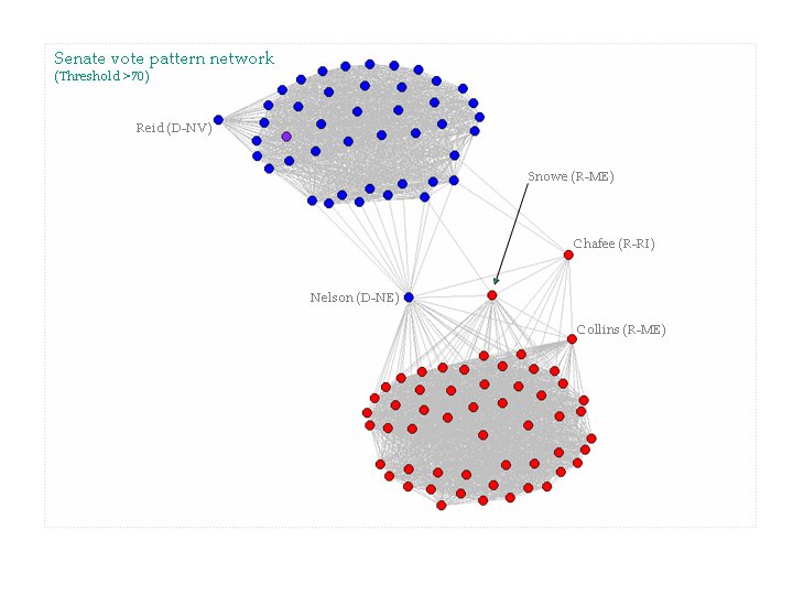
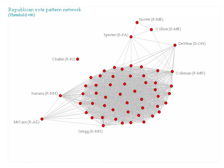
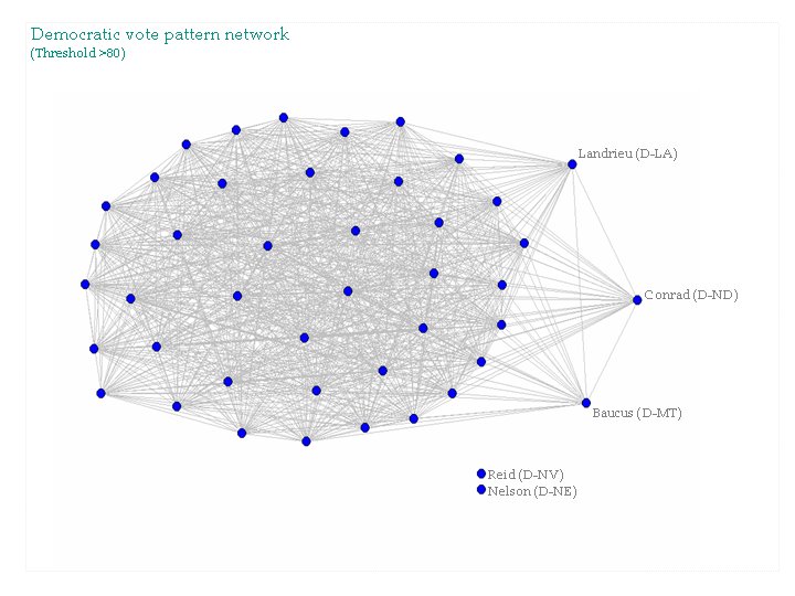
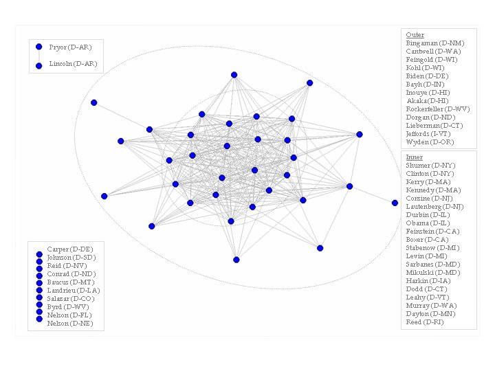
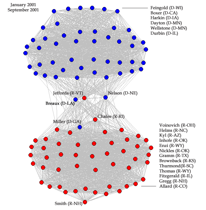
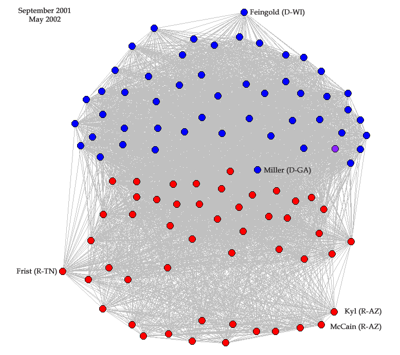
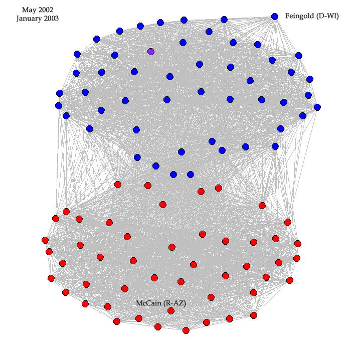
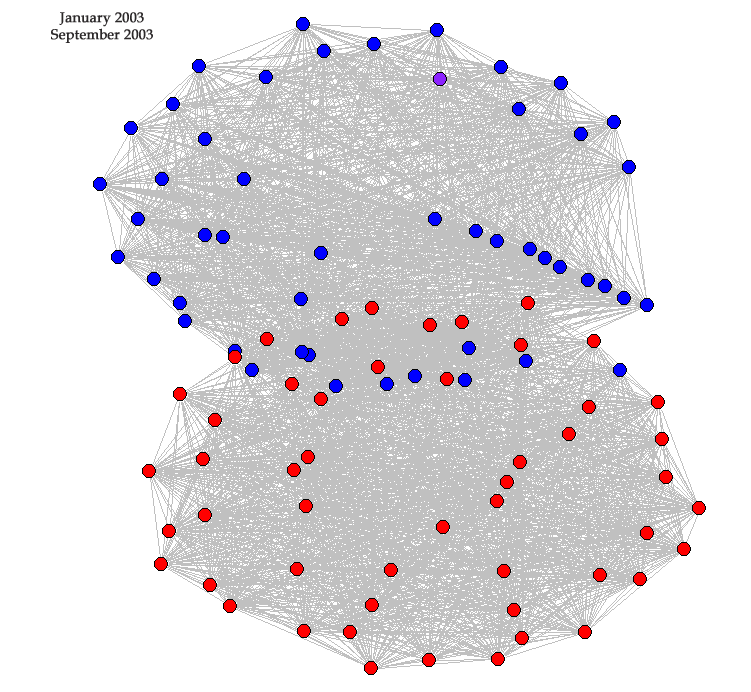
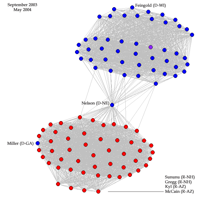
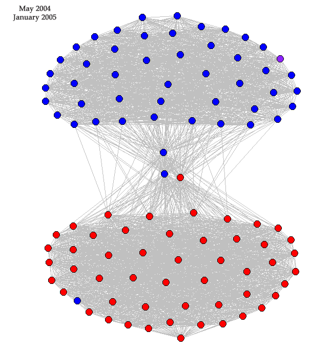
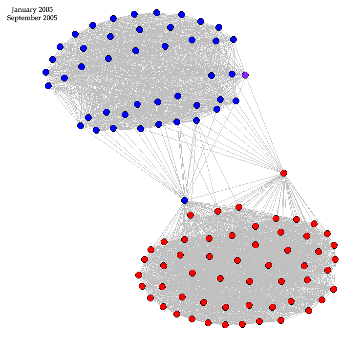
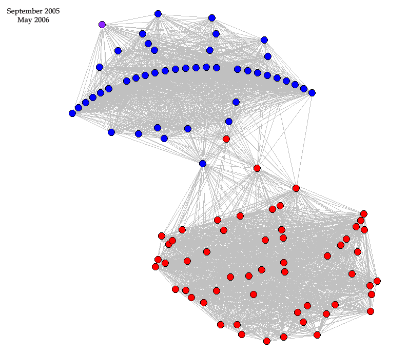
This is the final installment of the senate voting network analysis. I divided the last 64 months into eight equal periods and analyzed the senate voting patterns for each period. For an explanation of how I made the networks please see my last post. On a few of the graphs I have pointed out some of the senators, if there are specific senators that people are interested in I can identify them. Each individual network is shown below.

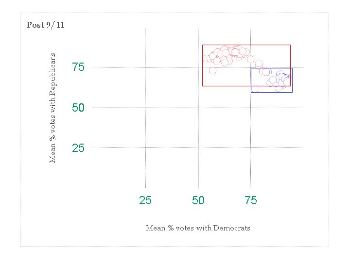
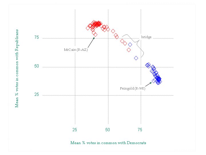
Above is a summary showing all eight networks (A) with additional plots. Part B of the above figure shows eight scatterplots as a view of how often senators vote within and outside their party (x-axis "% with Democrats", y-axis "% with Republicans"). The cross identifies the 50% mark. Part C of the above figure is an additional view of the same data. I made eight histograms of the difference between each senators vote within and outside the party. In this case, the right humps are made up of Republicans and the left Democrats. The final part (D) of the figure shows how the president's approval rating (based on many polls) has changed over the time period.

Although my original purpose for this blog was to simply show some interesting visuals of data, I do feel the need to point out some "findings". In the graphic above one can see the ebb and flow of polarization in the senate. The degree of polarization (best seen in B and C) changes with important events such as September 11th (less polarized), Invasion of Iraq (more polarized) and 2004 election (slightly less polarized). I find the period that included the invasion of Iraq as the most interesting. Although the senate is more polarized, based on a comparison of voting within and outside of a senator's party (again, above part B and C), the network does not show this. Instead, the network seems to lose much of its structure.

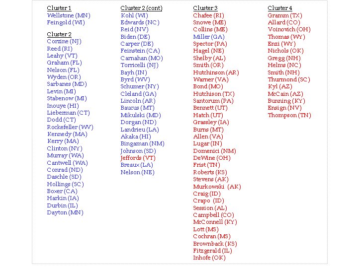
The other interesting thing that I have noticed from looking at these networks is that senators from New Hampshire and Arizona are consistently the most conservative. I am scoring conservative and liberal based on placement within the network (for a more thorough and quantitatively rigorous approach please see vote view). Although McCain is less consistent, he does tend to vote similar to his "Grand Canyon State" confederate, Kyl. Of the two, Arizona and New Hampshire, I find New Hampshire more interesting because of the disproportionate power that the New Hampshire voters possess. I'll leave it to others to debate how the out-dated primary system needs to be changed.


Monday, April 17, 2006

Senate Voting Patterns, part 2

Since my last post was well received I have decided to stretch the analysis of senate voting networks into additional posts. Also, I have included a graphic to help explain what these networks represent. All of the data presented in this post is from the U. S. Senate roll call votes for 2001.

The first figure, I hope, explains what these networks represent. You can see in part (A) there is a small table that is part of a large table of vote data. For 2001 there were 380 votes, here you can see ten votes for just three senators. I take all of the votes and compute a matrix similar the one in part (B). The matrix summarizes the percent of votes that senators have in common. I use the percent numbers to make networks. The links in the networks have a weight to them that is the same as the percent from the matrix. In Pajek, the network analysis program, I set thresholds to reduce the weak links. Part (C) show a network before and after the threshold.

In the networks that follow I have split 2001 into pre- and post- 9/11. Also, I have split each network into clusters. The clusters are based on partitioning that I performed using Pajek. To show the clusters I have simply boxed and numbered them. Following each network visualization I include a table showing cluster membership. The biggest difference between the pre-and post- 9/11 voting patterns is that after 9/11 the senate was less polarized. This was not a surprising finding, it will happen when there are 100-0 votes. But not all of the votes were unanimous and the changes were not symmetrical. The far right did not change very much, while the far left suddenly started to vote like conservative Democrats.


Another way to look at the voting changes after 9/11 is to plot how often senators voted within their party vs. outside their party. Again, the Democrats changed more than the Republicans. This can be seen best by comparing the boxes that I incuded that highlight the range or spread within each party. The Republicans retain a degree of heterogeneity, while the Democrats do not. You may remember that my previous post had a similar plot for 2005. From that it seems that the democrats have rebounded, by displaying a similar degree of voting heterogeneity that they had in the first eight months of 2001. Currently, I am analyzing data for the period between 2001 and 2005 to see when the rebound took place.

Thursday, April 06, 2006

Senate voting patterns

I have started analyzing the voting patterns in the Senate. Although this post involves political analysis, future posts may involve analysis of demographics, pop culture, sports, education, buying patterns, the stock market or anything else that I happen to be looking into at the time. I made a matrix that shows how often senators vote the same. For instance, Kerry and Kennedy voted the same direction 94% of the time, while Kerry and Frist cast the same vote only 34% of the time. All of these comparisons are corrected for the many times that senators do not vote. From the 100 x 100 matrix I was able to make graphs/networks of voting patterns by using various thresholds. The network below was made by using a threshold of >70%. I have highlighted a few senators. The networks were made with Pajek, a free social network analysis (SNA) program.
If we focus on the two major parties (treating Jeffords, an Independent, as a Democrat) we are able to see some internal structure.


By increasing the threshold we lose information but gain some insight into the core of each party. The core of the republican party is made up of what some might call "middle of the road" Republicans. While the core of the Democratic party is made up of the most liberal cluster of Democrats.


Another way to look at the data is to plot how each senator voted on average compared to all of the Democrats and all of the Republicans. The scatter plot below shows just that. I have highlighted McCain and Feingold as well as the "bridge senators". This view helps show how McCain's voting deviates from the other republicans. Some think of McCain as a moderate Republican, but he is anything but moderate. In every analysis he clusters with Sununu, Gregg, and Kyl, but does not vote similar to Chafee, Snowe, Collins or Specter, the true moderate republicans.